Sylara needed a credible identity, fast. So they called me.
Sylara already had a name, a flame mark and a strong internal vision. The work was to give those pieces a system where they could actually shine.
01 / Starting Point
It was green, but it still lacked life.
The existing identity had a flame pictogram and a lot of intention. What it needed was rhythm, rules and enough clarity for a team to use it consistently.
02 / Reality
The budget was small. The stakes were not.
The team needed to keep moving: presentations, conversations with future partners and investors, and a product still being built.
So the scope became sharper.
The work became a compact identity foundation: the visual decisions, usage rules and files needed to make the next steps look coherent, credible and usable.
03 / Logo System
The final identity kept the flame.
Two creative directions were explored, including a more light driven route. The work clarified something useful: the existing pictogram still carried recognition for the team.
Mark, wordmark and lockup became a usable set instead of a loose logo file.
Base word
Sylara
The name typed in Noto Sans gave a solid starting point, but it was still too rigid to sit naturally beside the flame.
Final wordmark
The final wordmark keeps the structure and softens the edges, so the identity feels credible without turning cold.
Lockup Version
04 / Colour
From loose ingredients to a system people could build with.
The work gave the identity hierarchy, contrast, typography, interface behaviour and colour roles. The result is still organic, but now every colour has a job.
Warm depth
Utility base
Accent
05 / Typography
Readable first.
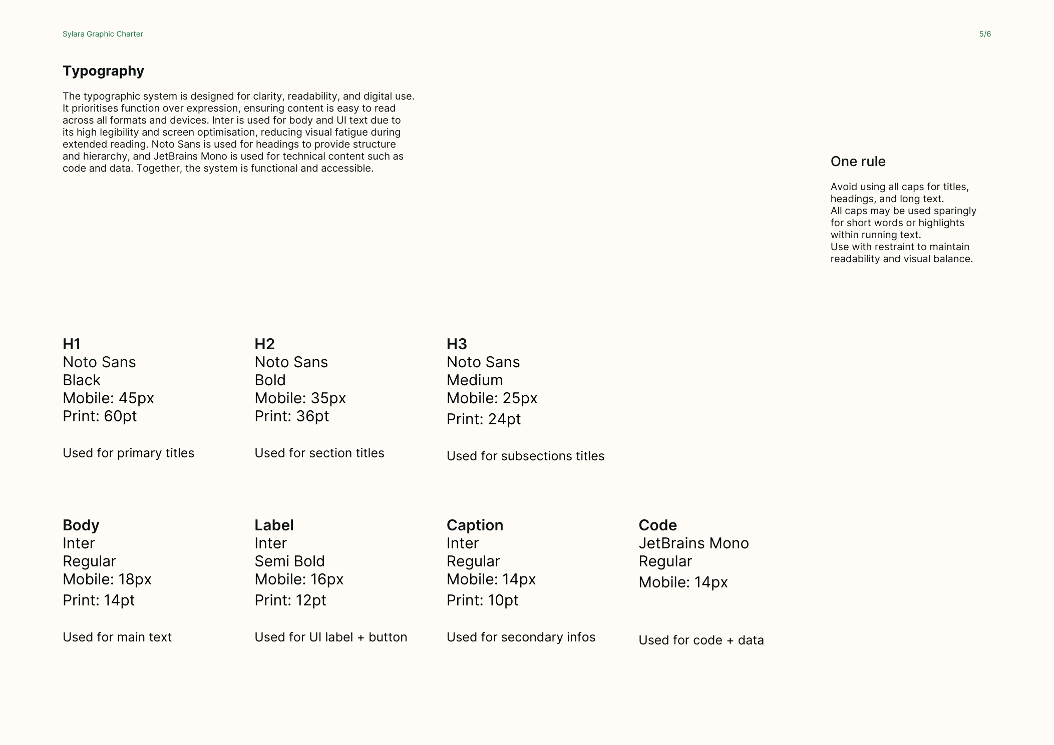
Noto Sans gave the system a global, practical backbone.
Inter does the quiet work: body text, labels and captions that can be read for a long time.
JetBrains Mono brings precision where the interface needs code, data or states to feel exact.
06 / Interface
UI states, not vibes.
Buttons, success messages and error messages were treated as part of the identity. Forest green carries action and confirmation. Red Earth carries errors without breaking the system.
Lucide was recommended for the icon layer, but the case study shows the components without fake icons rather than pretending assets existed.
Buttons
07 / Visual Signature
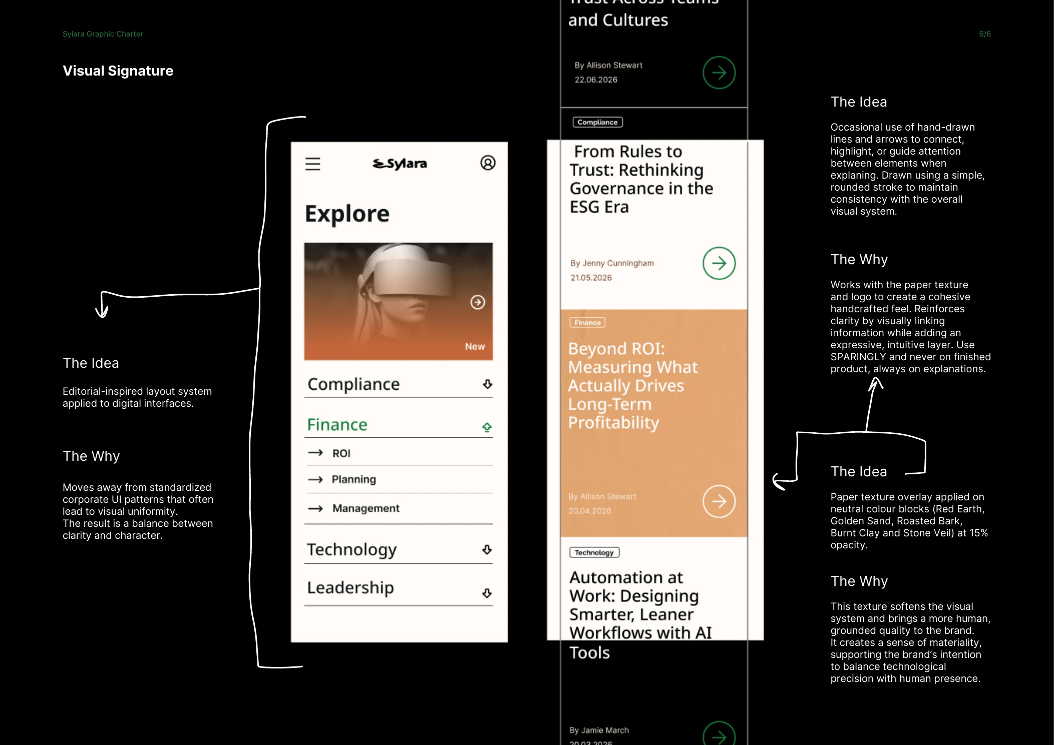
Editorial first. Then human texture, when it has a job.
A little less clinical. A little more human.
The paper texture brings materiality back into a digital first system. It gives the brand a tactile layer when the context needs softness, explanation or pause.
The arrows guide attention.
They are used sparingly, when something needs to be explained or connected. The point is to bring a human hand into the system without turning the finished product into decoration.
08 / Delivery
A compact package, made to be handed over.
Graphic Charter
6 pages
Logo, colours, UI, typography, visual signature and usage rules.
Logo Assets
Print + digital
Favicon, mark, wordmark and lockup files in the formats needed for use.
UI Foundation
States
Primary, outline, disabled, success and error directions.
Icon Layer
Lucide
A recommended library to keep interface icons consistent.
09 / Process
The feedback process became part of the work.
Brief
The client brought context, ambition and reduced scope.
Research
The strategic layer was lighter than a full audit, but still grounded in the platform, audience and implementation constraints.
Review
Email feedback was not always enough, so reviews moved into calls where the team could react, discuss and decide.
Decision
The final system came from listening carefully, then still giving a clear visual point of view.
10 / Outcome
A usable foundation, honestly shown.
The platform was still being built after the project, so the honest result is a clearer, documented visual foundation.
Enough structure for the team to keep building without restarting the identity conversation every time a new visual decision appears.
Charter preview
11 / Feedback
“I especially valued Svetlana's ability to create a visual strategy that felt fully coherent with the newborn brand. She opened a new way for our team to see and express the brand visually. The process was extremely efficient and timely, and I also appreciated her patience with the team and the mature way she managed feedback throughout.”
Anca Coriiu · Sylara
Want the same kind of clarity?
Bring the mess.
I will bring the structure.
Nicely, mostly.
If your identity already has pieces but not yet a system, this is exactly the kind of work Visual Identity Creation is built for.